
A mobile-friendly menu helps guests decide without fighting the screen
For many restaurants, the first menu a guest sees is on a phone. They scan a QR code, open a link from Google, or tap through from Instagram. They may be standing outside, sharing one device at the table, or trying to read with one hand while carrying a drink.
That context changes what a good menu needs to do. A desktop layout squeezed onto a narrow screen makes people zoom, swipe sideways, and lose their place. A mobile-friendly restaurant menu lets them move from category to dish to decision with less effort.
The fix is not to make every element smaller. Give the important information room, keep the path predictable, and test the menu on a real phone. If you are still deciding how the full system should work, start with Digital menu for restaurants: how it works, benefits, and why to adopt it. This guide focuses on making the public menu comfortable to use.
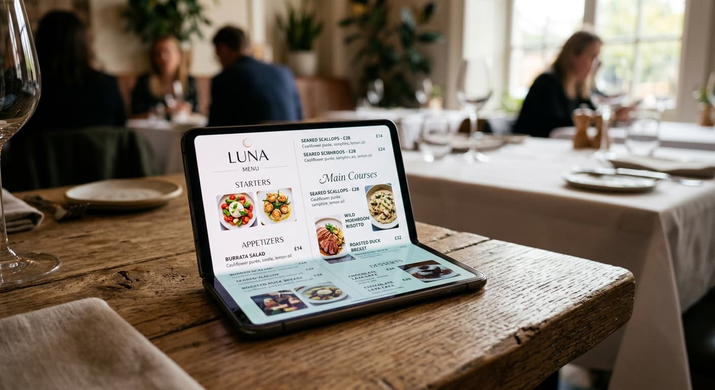
What makes a restaurant menu mobile-friendly?
A mobile-friendly menu should let guests:
- open it quickly after scanning or tapping a link;
- read the menu without zooming or horizontal scrolling;
- understand the difference between categories, dishes, options, and prices;
- tap navigation, language, and dietary controls without hitting the wrong target;
- find the details that affect their choice, such as portions, ingredients, and availability; and
- return to the menu after checking one item without losing their place.
This is a usability standard, not a visual style. A menu can look polished and still be tiring to use. A plain menu can work well if the type is readable, the sections are clear, and the controls behave as expected.
Google recommends responsive web design as the easiest mobile pattern to implement and maintain. It also uses mobile-first indexing, which means the mobile version of a page deserves the same content and care as the desktop version. Why digital menus improve restaurant SEO explains the search side. Here, the priority is the guest standing in front of the table.
1. Start with the first ten seconds
The opening screen should answer three questions quickly:
- What restaurant is this?
- Am I looking at the current menu?
- Where do I tap to find what I want?
Show the restaurant name, the active service or menu period, the available languages, and the first useful navigation choice. If the menu is for lunch, say so. If dinner starts at 5 p.m., do not make guests discover that after opening a dish that is not available yet.
Keep the first screen light. A large promotional image, an autoplay video, or a long introduction pushes the actual menu below the fold. Put the food and the next action close to the top.
The same rule applies when the menu opens from Google, a website, or a social profile. Every entry point should lead to the same live menu, not to an old PDF or an unexplained landing page. How to add your restaurant menu to Google Business Profile and How to add your restaurant menu to your website cover those paths in more detail.
2. Organize categories for a phone screen
Mobile guests scan vertically. They should not have to decode a wall of text or open every category just to understand the offer.
Use categories that match how guests choose. Depending on the restaurant, that might mean:
- small plates;
- starters and soups;
- mains;
- sides;
- desserts; and
- drinks.
Do not create a separate category for every few items just to shorten the page. Too many choices at the top make navigation harder. Too few categories force guests to scroll through unrelated dishes.
Keep category names short and familiar. If the kitchen uses an internal name that guests will not recognize, use the guest-facing term first. Put the category navigation in a predictable place, and make it easy to return to the top or switch sections.
For more on category order, item grouping, and mobile scanning, see How to Organize a Restaurant Menu for Faster, More Confident Orders.
3. Put the decision-making details near each dish
A guest should not need to open three screens or ask a server for basic context. Each item needs enough information to support the next decision.
For most dishes, check that the menu shows:
- a clear name;
- a short description of the main ingredients and preparation;
- the price and portion context;
- relevant dietary or allergen information that the restaurant has reviewed;
- options, substitutions, or add-ons that change the order; and
- availability when the item is limited to a service, day, or location.
Do not fill every card with a paragraph. Mobile users need useful detail, not a recipe story. How to Write Restaurant Menu Descriptions That Help Guests Order has a practical approach for deciding what belongs in the description.
Keep prices visually close to the item they describe. If a price depends on size, make the sizes and their prices obvious. If a side is not included, say so before the guest assumes it is.
If a photo helps explain the dish, use one that loads quickly and reflects what the kitchen serves. A large image that delays the menu is not doing the guest a favour. Responsive images can reduce the data sent to smaller devices, especially when the original image is much larger than the space where it appears.
4. Make every tap forgiving
The menu may be used by someone with one hand, a cracked screen, a weak signal, or a table that is shaking as people move around it. Small, tightly packed controls turn simple navigation into guesswork.
Give links, buttons, language switches, filters, and category tabs enough size and spacing. WCAG 2.2 sets 24 by 24 CSS pixels as a minimum target size for most pointer controls, with exceptions when enough spacing separates smaller targets. Treat that as a floor, not as a design goal. Larger controls are easier to use.
Check the basics:
- Can a guest tap a category without opening the one beside it?
- Is the language switch easy to find without covering the menu?
- Can someone close a dish detail or filter with a clear action?
- Does the back button return to a sensible place?
- Are links and buttons visibly different from ordinary text?
If the answer depends on a perfect tap, the control needs more room.
5. Keep text readable without zooming
Readable text is more than a large font. It also needs enough contrast, line spacing, and width.
Avoid long lines that run edge to edge on a phone. Keep descriptions short enough to scan, but do not reduce the type until the words become decoration. Make sure text remains readable when a guest increases the browser text size or uses a screen magnifier.
Check the menu in bright daylight and in a dim dining room. A pale grey description that looks elegant on a laptop may disappear beside a window. A textured background can make prices and dietary labels harder to find.
The accessibility guide Digital menus and accessibility: making ordering easier for everyone covers contrast, structure, language, and screen-reader considerations in more detail.
6. Test the complete guest path on a phone
Do not stop after checking that the homepage loads. Test the path a guest actually takes:
- Scan the QR code from a phone that is not connected to the restaurant's Wi-Fi.
- Open the menu from the website and Google profile.
- Confirm that the current service, language, and location are correct.
- Find a popular dish without using search.
- Open the dish and read the description, price, portion, and dietary details.
- Switch language and repeat the same check.
- Rotate the phone and return to the previous section.
- Try the menu with text size increased.
- Check a slow connection and a device with less storage or an older browser.
Ask someone who did not create the menu to do the test. Writers know where information is supposed to be. Guests only know where it is.
Record the device, entry point, problem, owner, and fix. Link the change to a restaurant menu audit before service when the issue affects several categories or channels.
A quick mobile menu checklist for service week
Use this short check before a busy period or after a menu update:
- The QR code opens the current live menu.
- The restaurant name and service period are clear.
- The first screen does not hide the menu behind a large image or message.
- Categories are short, familiar, and easy to switch between.
- Text fits the viewport without horizontal scrolling.
- Dish names, prices, portions, descriptions, and availability agree with the kitchen.
- Dietary and allergen information has been reviewed before publication.
- Buttons, links, filters, and language controls have enough space.
- Images load quickly and match the food served.
- The menu works in every published language and on the main entry points.
- A person outside the editing process tested it on a phone.
Keep the checklist with the restaurant's menu change log. That way, a mobile problem has an owner and a date instead of becoming another repeated explanation at the table.
Make the phone version the real menu
A mobile-friendly restaurant menu is easy to recognize. Guests can open it, find a category, understand a dish, and move back when they need to. They do not have to pinch the page, chase a tiny button, or guess whether a price belongs to the item above or below it.
Review the first screen, category structure, item details, controls, text, images, and entry points together. Then test the live path with a real phone before service. Menuit helps restaurants keep that menu available at a stable public link, with live updates and view analytics to support the next review.