
A well-organized menu helps guests decide
When a guest opens a menu, they are usually trying to answer a few simple questions: What kind of food is available? What sounds good right now? How much does it cost? Can I order it with my dietary needs? A menu that makes those answers hard to find creates work for the guest and for the service team.
Organizing a menu is not about adding more boxes, badges, or decorative labels. It is about making the next decision obvious while keeping the information accurate. That matters even more on a phone, where a guest is scrolling with one hand between conversations, children, or a busy service.
If you are deciding whether to move your menu online, start with Digital Menu for Restaurants: How It Works, Benefits, and Why to Adopt It. This guide focuses on the structure of the menu guests see after they scan.
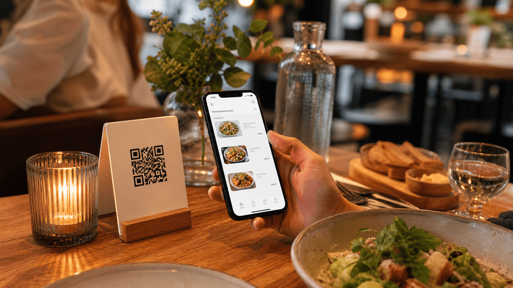
1. Organize categories around the guest's decision
Start with the order in which guests naturally explore the offer, not the order in which the kitchen stores ingredients. A full-service restaurant might use:
- drinks or aperitifs,
- starters and small plates,
- mains,
- sides,
- desserts, and
- coffee or after-dinner drinks.
That does not mean every restaurant needs those exact sections. A bakery, bar, tasting menu, and neighborhood lunch spot have different service patterns. The useful test is whether a guest can predict where an item belongs without asking.
Keep category names familiar. “From the sea” may sound distinctive, but “Fish and seafood” is easier to scan if the guest is looking for a specific option. You can keep personality in the short introduction or item descriptions while allowing the category label to do its navigation job.
Avoid overlapping categories that force an item to appear in several places. If a grilled vegetable plate could be a starter, side, and vegetarian option, choose one primary home and use a clear dietary label or short note to help guests find it. Repeating the item in three places makes updates and translations easier to get wrong.
2. Give every item the same basic information
Guests should not have to learn a new layout for every category. Use a repeatable structure:
- Clear dish name.
- Short description of what arrives on the table.
- Portion, serving context, or included sides when it matters.
- Dietary label or relevant ingredient note.
- Price and any important pricing condition.
For example:
Roasted cauliflower with tahini
Charred cauliflower, lemon tahini, herbs, and toasted seeds. Served as a small plate. €9
That is enough to help a guest understand the dish without turning the menu into a recipe book. How to Write Restaurant Menu Descriptions That Help Guests Order goes deeper into the writing itself.
A review of menu design research identifies item position, descriptions, labels, and the characteristics of the menu itself as important dimensions of how guests perceive and choose items. The point is not to copy a magic layout. It is to make the information consistent enough that guests can compare options confidently. See Menu Design: A Review of Literature for the research overview.
3. Make price and portion information hard to miss
Price anxiety often comes from missing context rather than from the number itself. Show the price close to the item it belongs to, use one currency format throughout, and explain conditions that change the total.
Be explicit when an item is:
- priced per person,
- sold by weight,
- available only as a table minimum,
- served with a side or sauce,
- a supplement to a set menu, or
- available in more than one portion.
“Market price” may be appropriate for a fish or a special ingredient, but it should not make a guest guess whether to ask for today's amount. Give the team a clear way to answer and update the menu when the price is known.
The same applies to add-ons. If a steak is shown without the price of a required side, or a cocktail lists a spirit upgrade with no supplement, the guest cannot compare the options properly. Clear pricing supports trust even when the final choice is not the most expensive one.
4. Keep the menu easy to scan on a phone
A digital menu is not a PDF squeezed onto a smaller screen. Guests should be able to scroll through a category, recognize item boundaries, and return to the category list without losing their place.
Use:
- clear headings for categories,
- short paragraphs instead of dense blocks,
- enough space between items,
- readable prices with consistent alignment,
- images only where they add useful context, and
- controls and links that are comfortable to tap.
Do not hide essential information inside an image. Text is easier to resize, translate, search, and read with assistive technology. The W3C menus tutorial recommends reflecting structure in markup and using clear labels for interactive menus; the same principle helps a restaurant menu remain understandable on different devices.
Read Digital Menus and Accessibility: Making Ordering Easier for Everyone for a fuller accessibility checklist. A clearer structure benefits guests who use assistive technology, but it also helps anyone reading in bright sunlight, with a small screen, or in a second language.
5. Use labels that answer real ordering questions
Labels are useful when they reduce uncertainty. They are not useful when every item receives a badge and nothing stands out.
Consider labels for questions guests actually ask:
- Is it vegetarian or vegan?
- Does it contain a common allergen?
- Is it spicy?
- Is it alcohol-free?
- Is it a house specialty or a limited-time item?
- Is it a single portion or meant for sharing?
Keep the wording specific and use the same meaning everywhere. If an item is vegetarian but is cooked on shared equipment, do not use a broader claim that could imply something else. Dietary and allergen information should be checked with the kitchen and presented according to the requirements that apply in your location. Menuit can help publish the content, but the restaurant remains responsible for reviewing the information before service.
6. Use menu engineering to decide what deserves attention
Organization should make the menu easier to use, not disguise weak decisions. Before featuring an item, review its sales, current direct cost, availability, service effort, and role in the category.
Restaurant Menu Engineering: A Practical Guide to More Profitable Decisions explains how to compare popularity and contribution margin while considering labor, waste, dietary needs, and execution. Use that review to decide which items need protection, clearer explanation, a price or recipe review, or a planned retirement.
Then feature items honestly. A “house favorite” label should mean the team can explain why it is a favorite, not that every guest must choose it. A limited-time badge should include an end date or service window so it does not become permanent menu decoration.
Do not assume that a decorative box or a particular screen position guarantees more sales. Item placement can be part of a test, but guest demand, price, substitutes, availability, and the quality of the description all affect the result. Change one meaningful variable at a time where possible and keep notes about what happened.
7. Test the menu with people who did not write it
Owners and chefs know the menu too well to be its only reviewers. Before publishing a new structure, ask a team member or a trusted guest to complete a few tasks on a phone:
- Find a vegetarian main course.
- Find the price and portion of a sharing dish.
- Identify which dessert is available today.
- Explain what a less familiar dish contains.
- Return to the main categories and find a drink.
Watch where they pause, scroll back, or ask for help. Those moments are more useful than a general opinion that the menu “looks good.” Keep a note of repeated questions during service as well. If several guests ask whether a side is included, the menu needs a clearer answer.
Menuit currently reports menu views over time, not item-level popularity. Use your point-of-sale data, booking or service notes, and team observations for item decisions. Treat a change in sales as a signal to investigate rather than proof that one layout change caused it.
8. Keep the organized menu accurate
A beautiful structure loses its value when the item is sold out, the price is old, or the translated description no longer matches the kitchen. Give one person ownership of the live menu and add a short review before each service:
- remove or hide unavailable items,
- check prices and required supplements,
- confirm descriptions against the current recipe,
- review dietary and allergen details,
- confirm translations for changed content, and
- test the public QR link on a phone.
How to Keep Your Restaurant Menu Accurate Across Every Channel covers the wider routine for aligning QR codes, Google, social profiles, and printed materials. The goal is simple: the menu a guest scans should be the menu the team is ready to serve.
A practical restaurant menu organization checklist
Before your next menu update, ask:
- Can a guest predict which category contains each item?
- Does every item show a clear name, description, price, and relevant context?
- Are portions, supplements, and sharing conditions explicit?
- Can someone scan the menu comfortably on a phone?
- Are dietary labels specific, consistent, and reviewed by the restaurant?
- Do featured items have a real operational reason for their prominence?
- Has someone outside the menu-writing process tested the guest path?
- Is there an owner and a pre-service routine for keeping it current?
The best menu structure is the one that helps a guest choose and helps the team deliver the same promise. Start with one category, remove one point of confusion, and watch the questions that disappear during service.
Make the next order easier
Your menu does not need to sound like a sales script. It needs to make the food, price, and choice clear enough that a guest can move forward with confidence.
Menuit helps restaurants keep that working menu live, mobile-friendly, and easier to update as items, prices, translations, and specials change. Organize the content around the guest's decision, review it with the service team, and publish the version the kitchen is ready to support.