
A Better Customer Experience Starts Before the Order
Restaurant customer experience is shaped by dozens of small moments: finding the entrance, getting a table, understanding the menu, asking about ingredients, placing an order, and deciding whether to come back.
A digital menu will not fix a slow kitchen or replace good service. It can remove a surprising amount of friction from the part of the visit where guests are trying to decide what they want.
That matters because menu confusion has an operational cost. A guest who cannot find the drinks section asks a server. Someone who cannot tell whether a dish is spicy hesitates or chooses the safest option. A table that is ready to order but still waiting for a menu loses time before the first round begins.
The best digital menus help guests move through those moments with less effort. They open quickly, make the next choice obvious, and give people enough information to order without turning the menu into a wall of text.
If you want the broader picture first, Digital Menu for Restaurants: How It Works, Benefits, and Why to Adopt It explains the operational case. This article focuses on the guest experience: what changes after someone scans the code and how to make those changes useful in a real service.
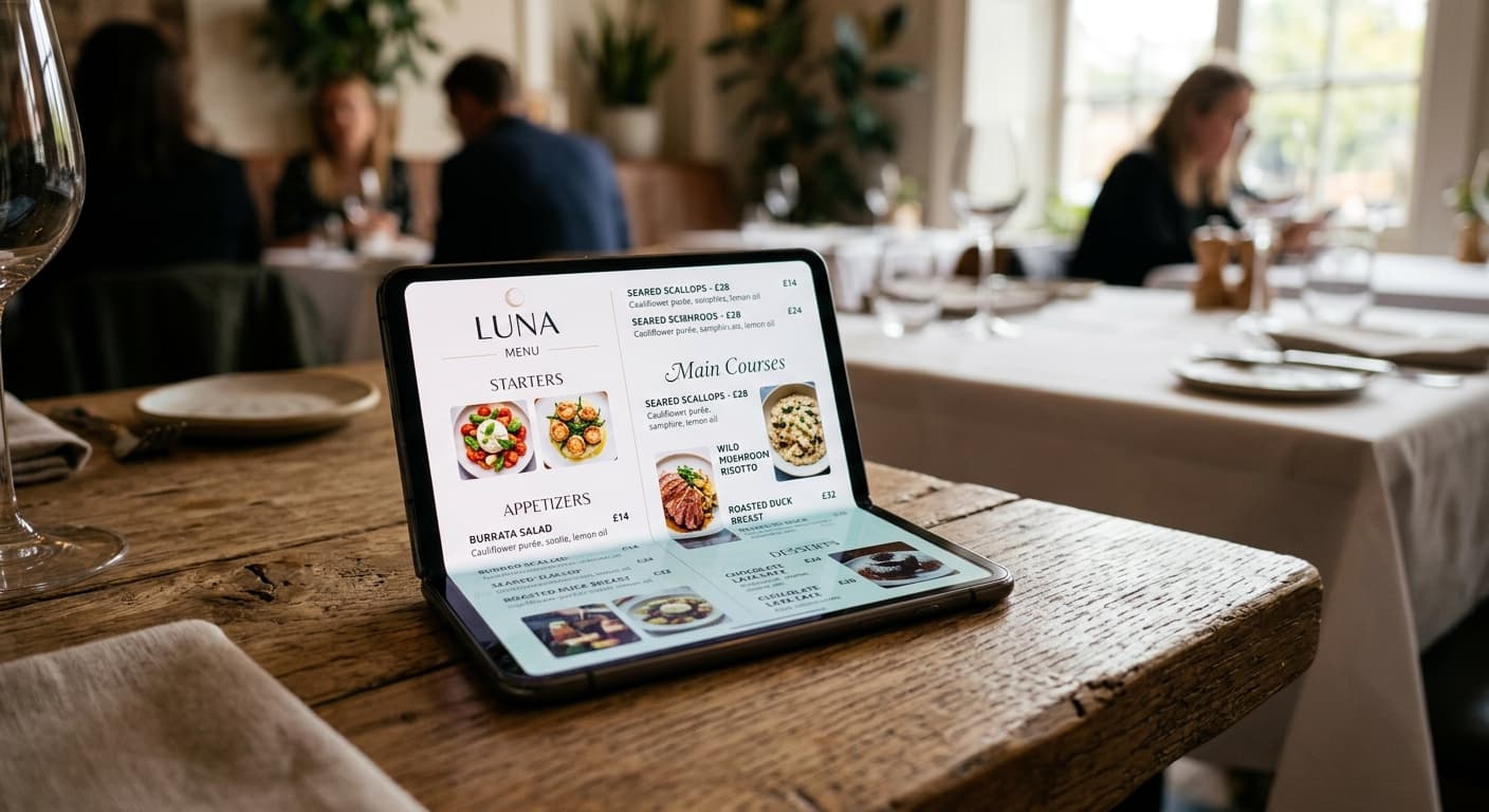
1. Guests can start browsing straight away
In a traditional service flow, a guest may wait for a server to bring a menu, wait again while the table decides, and then ask for a drinks list or dessert menu later. That is not always a problem. But during a busy lunch, a full dining room, or a counter-service rush, every delay is noticeable.
A QR code menu gives guests a way to start on their own. They scan the code, open the menu in their browser, and begin browsing while the table settles in. There is no app download or account to create.
That does not mean the restaurant should use the menu as an excuse to disappear. It means the guest can use the waiting time well. A couple can look at the menu before the server arrives. A parent can find the children's options while getting a stroller settled. Someone waiting at the counter can decide between two lunch combinations before reaching the till.
The scan is only useful if the page opens reliably. Test the experience on mobile data, not only on the restaurant's Wi-Fi, and check the first screen on an older phone as well as a new one. For more practical placement and testing ideas, see QR Code Menu: How It Works in a Restaurant.
2. Clear categories reduce decision fatigue
Guests should not have to understand how the kitchen is organized in order to find dinner.
Printed menus can show several sections on one spread. On a phone, guests usually see one narrow screen at a time. That makes the order and naming of categories much more important. “Food” and “Other” are not useful navigation. “Starters,” “Mains,” “Drinks,” and “Desserts” tell a guest where to go next.
Good category structure helps in practical situations:
- A guest who only wants a drink can find cocktails without scrolling through every dish.
- A group with dietary requirements can get to the relevant options quickly.
- A table ordering a small plate can see starters before the full list of mains.
- Someone checking the menu from outside can understand the offer without opening a PDF and zooming around.
Keep the structure familiar, then adjust it to how people actually order. If your cafe sells coffee, pastries, sandwiches, and brunch, those sections may be more helpful than a copy of the kitchen's internal prep stations. If your bar has a short food menu, putting signature drinks first may match the reason many guests are there.
3. Better descriptions give guests confidence
The difference between “seafood pasta” and “linguine with prawns, chilli, garlic, and lemon” is not just copywriting. It is decision support.
Guests need enough detail to understand what they are choosing, especially when the menu includes unfamiliar ingredients, local dishes, tasting formats, or dishes with similar names. A short, specific description can prevent a question and make a signature item feel worth trying.
Useful menu details often include:
- the main ingredients,
- the cooking style or flavour profile,
- whether a side is included,
- a spice level or preparation note,
- a clear indication when an item is vegetarian, vegan, or contains a common allergen.
The goal is not to describe every plate like a cookbook. Give more context to the dishes where context changes the order. A well-known house burger may need very little explanation. A regional stew, natural wine, or chef's special probably needs more.
This also helps the floor team. If five tables ask what comes with the same dish, the menu is missing information that guests clearly need. Add the answer once, in the place where people are making the decision, and the whole shift benefits.
4. Photos can answer questions words cannot
Photos are useful when they help a guest judge a dish: its portion style, presentation, ingredients, or level of indulgence. They are less useful when every item has a small, inconsistent image that slows down browsing and makes the menu feel crowded.
Start with the items where a photo does real work:
- a signature dish people come to the restaurant to try,
- a sharing plate where portion size matters,
- a dessert that is hard to picture from the name,
- a cocktail where presentation is part of the appeal.
Use the same standard you would use for a printed menu. If an image makes the dish look much better than what reaches the table, it creates disappointment instead of confidence. A fast-loading, honest photo is more valuable than a large gallery that guests never finish scrolling.
5. Language options make ordering less intimidating
For a tourist, a menu can be the most important conversation before the order. Even when the guest speaks some of the local language, unfamiliar ingredients and preparation terms can make a choice feel risky.
A second language version can help a guest understand the difference between dishes, ask a more focused question, and choose something beyond the safest familiar option. It can also reduce the number of times the team has to repeat the same translation during a busy shift.
Translation still needs review. Prices, allergens, dish names, and culinary terms deserve a human check before the language option goes live. AI can accelerate the first draft, but it should not be the final authority on an ingredient or dietary claim. Speaking Your Guests' Language: How to Increase Average Order Values covers the commercial side of that work in more detail.
6. Accessibility is part of customer experience
A menu that is easy for one guest to use may still be difficult for another. Small text, weak contrast, tiny category buttons, and long unstructured pages create problems for people using a phone in bright sunlight, with low vision, with limited dexterity, or with an assistive technology.
W3C's mobile accessibility guidance points restaurant teams back to the same web accessibility principles used elsewhere: content should be readable, structure should make sense, and interactive controls should be usable. In practice, that means:
- use readable type and enough contrast between text and its background,
- give categories and controls enough space to tap without precision,
- use headings that describe the section instead of decorative labels alone,
- avoid putting essential information only inside an image,
- make dietary, allergen, and language information easy to find.
This is not a separate “accessibility version” of the menu. It is a better default for everyone. A guest holding a phone in one hand, sitting in dim light, or trying to order quickly benefits from the same clarity.
7. Live updates protect trust
Nothing damages confidence faster than a menu that promises something the restaurant cannot serve.
If the kitchen runs out of the catch of the day, the item should not stay prominently visible until closing. If a lunch special ends at 15:00, it should not still appear as the first offer at 18:30. If a price changes, the public menu should reflect it before the next table relies on the old information.
A live menu makes those corrections possible without a new print run. The important part is to give the workflow an owner. Decide who can update the menu, which changes need to happen immediately, and when someone checks the menu before each service.
That routine prevents a common failure mode: the digital menu is accurate on launch day, then slowly drifts away from what the restaurant actually serves. Common Mistakes When Implementing a Digital Menu has a fuller checklist for avoiding that drift.
A practical customer-experience checklist
Before you put a QR code on every table, test the menu as a first-time guest:
- Scan it with a normal phone camera and confirm it opens in the browser.
- Check the first screen: can a guest tell what to do next?
- Find drinks, specials, desserts, and dietary information without asking for help.
- Read it on mobile data and in the lighting where guests will actually use it.
- Open two similar dishes and check whether the descriptions make the difference clear.
- Confirm that prices, availability, allergens, and language versions are current.
- Ask someone unfamiliar with the menu to find one item while you watch.
That last test is valuable because restaurant teams know their own categories too well. If a new guest cannot find something, the problem is usually the structure, not the guest.
The point is less friction, not more technology
A digital menu improves customer experience when it makes ordinary decisions easier: opening the menu, finding a category, understanding a dish, checking a dietary detail, choosing an unfamiliar item, and knowing that the information is current.
It should support the team, not replace hospitality. Keep printed menus available for guests who prefer them. Let staff answer questions and make recommendations. Use the digital menu for the information that changes often and the details guests need to browse at their own pace.
Menuit helps restaurants turn an existing menu into a mobile-friendly, live menu that can be reviewed, translated, and updated without rebuilding the experience every time. The product is a menu system, not an ordering or payment platform. That narrower focus is useful: it keeps the guest journey clear from the first scan to the final choice.
If your current menu makes guests pinch and zoom, wait for basic information, or ask the same questions every shift, start with one service area. Upload the menu you already have, simplify the mobile structure, test it at a real table, and improve the parts that create the most hesitation.